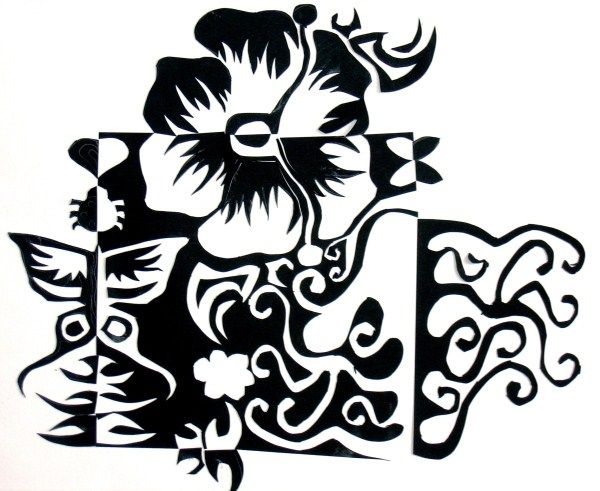
Light, Dark & Beyond • The Pedagogy of Visual Balance
The Art and Science of Notan
Expanding the square trains your eye to see pure spatial harmony.
This is the definitive Notan resource for educators and artists,
from Arthur Wesley Dow’s revolutionary 1899 curriculum to modern
color theory and digital vector fabrication.
STUDIO PHILOSOPHY • AUGMENTATION, NOT REPLACEMENT
Studio Notan is an augmentation and pre-visualization planning tool, never a replacement for physical cut-paper practice. Use it after your hands-on sketching and cutting experiments, and before you commit to final design decisions, paper color choices, and blade cuts.
The Expansion of the Square: Mass is conserved, space is transformed.
Start here
Three ways into notan
Read the idea, practice it with an activity, then make your own in the studio. Each path
below leads to more: a guide to every tool, an activity for every element of art and
principle of design, and a challenge at the end of each.
Learn the vocabulary
Line, shape, value, balance, rhythm: the elements of art and the principles of design,
each shown the way a cut sheet of paper shows it.
Sixteen activities, each made twice: in the studio, and by hand with paper and paint. Each
has its own learning outcomes, the art history and design practice behind it, and a
challenge to finish.
Notan is a profound philosophical inquiry into the mutual arising of opposites, spatial
conservation, and Gestalt psychology. It is far more than a decorative craft.
CONCEPT
The Meaning of Nōtan (濃淡)
The term Nōtan comes from ancient Japanese ink-wash painting (Sumi-e).
It translates literally as 濃 (nō = dense, dark, concentrated)
and 淡 (tan = faint, light, dilute). Western chiaroscuro uses
continuous gradients to sculpt illusory three-dimensional volumes. Notan instead evaluates
the flat, graphic, structural equilibrium between light and darkness.
GEOMETRY
The Expansion of the Square
At the heart of the studio assignment lies a strict geometric invariant:
Conservation of Visual Mass. You begin with a finite black square, and every
shape you excise from within its boundary must be hinged across that same edge into the
surrounding white ground. No material is added; no scrap is discarded. The total area of black
and white remains constant, yet the perceived visual field explodes outward.
PERCEPTION
Figure-Ground Equilibrium
Notan forces your brain out of “object recognition” mode and into “spatial field” awareness.
When you carve a negative hole inside the square, the surrounding white field invades
the dark space. Simultaneously, the dark mirror invades the void. When you work with high
intentionality, figure and ground become interchangeable, echoing the Gestalt Rubin Vase.
Pedagogical Lineage
Edo Woodblocks, Dow and the Bauhaus
A traditional Japanese visual discipline crossed the Pacific to revolutionize Western art education,
shaping American Modernism and the Bauhaus foundation course.
17th – 19th Century
Sumi-e and Ukiyo-e in Edo Japan
The mastery of Japanese printmakers like Hokusai and Hiroshige relied on bold, flat shape relationships
rather than vanishing-point perspective. Western artists, constrained by centuries of academic
modeling, had lost touch with pure two-dimensional spatial rhythm.
1890s Boston
Fenollosa & Dow’s Synthesis
Ernest Fenollosa, curator at the Boston Museum of Fine Arts, collaborated with American artist
Arthur Wesley Dow. Dow realized that Western art training was stifled by mechanical copying of
nature. He sought an essential visual grammar that was universal to all creative expression.
1899 Landmark
Publication of Composition
Dow published Composition: A Series of Exercises in Art Structure for the Use of Students and Teachers.
He organized visual art into a rigorous triad: Line, Notan, and Color.
He declared Notan to be the vital bridge without which neither line nor color could hold visual weight.
1910s – 1920s
O’Keeffe & American Modernism
Dow taught at Columbia University Teachers College, training generations of instructors.
Among his most famous students was Georgia O’Keeffe, who credited Dow’s Notan exercises
with liberating her from academic realism and teaching her to fill space with emotional authority.
1920s – Present
The Bauhaus & Contemporary Studios
Johannes Itten and Josef Albers incorporated similar contrast and spatial economy into the
celebrated Bauhaus Vorkurs. Today, the cut-paper square remains the gold-standard introductory
exercise in university foundation programs and secondary art curricula worldwide.
Historic Visual Archive & Masterwork Studies
Select any plate to inspect its ultra-high-resolution master scan and a detailed Notan compositional analysis.
7 MASTER PLATES • INTERACTIVE LIGHTBOX
Elements & Principles
Every Element and Principle in Paper
A notan is one of the clearest places to see the vocabulary of design at work, because it
has only a sheet, its holes and their mirrored pieces. Each tile opens an activity built
around one element of art or principle of design.
Acknowledge the discipline of traditional black-and-white, then master the chromatic frontier.
◐
Notan Is Traditionally Black and White
Traditionally, Notan strictly forbids color, because color is an emotional intoxicant.
A bright hue can distract you into believing a composition is dynamic when its underlying
value structure is completely hollow. However, once you have internalized the foundational discipline
of dark and light, introducing color is the most transformative next step in the entire exercise.
1. Pure Value Notan (Traditional)
✓ 100% LUMINANCE CONTRAST
Pitch black (#111111) on pure white (#FFFFFF). Your eye perceives instant edge clarity,
uncompromised structural tension, and absolute figure-ground delineation.
2. The Color Trap (Equal Luminance)
✗ FAILS THE SQUINT TEST
Middle Red on Middle Green. Although the hues are complements, their grayscale luminance is
almost identical (~48%). Under the squint test, the boundary turns into visual mud and vibrates unpleasantly.
3. Chromatic Notan (Calibrated Value)
✓ VALUE + HUE HARMONY
Deep Midnight Navy (#0F172A, 10% lum) on Pale Warm Apricot (#FFEDD5, 92% lum).
This pair maintains the ruthless structural contrast of Notan while leveraging temperature and chromatic richness.
VALUE VS. HUE
The Primacy of Luminance
Human rod cells process lightness and darkness far more rapidly than cone cells process hue.
In painting and graphic design, values do all the work, while colors get all the credit.
When you execute a chromatic Notan, you must select colored papers with at least a 60% luminance
spread to maintain structural integrity.
JOSEF ALBERS
Simultaneous Contrast in Reverse
In his legendary Interaction of Color (1963), Josef Albers demonstrated that a single color
appears as two distinct shades when placed against differing backgrounds. In Notan, when you flip an excised
colored piece outward, it changes its optical identity instantly as it crosses into the opposing ground color.
TEMPERATURE
Advancing & Receding Tension
Warm colors (reds, oranges, warm ochres) visually advance toward the viewer, while cool colors
(blues, teals, indigos) recede. When you cut a warm interior shape and reflect it across into a cool
exterior, you introduce subtle spatial depth and illusory relief into what remains a physically flat sheet.
3-VALUE STUDY
The Neutral Mid-Tone Anchor
Dow’s greatest curriculum invention was the 3-Value Notan. Instead of two colors,
you begin with a neutral mid-tone paper (such as 50% French Gray or raw Kraft paper).
White elements cut in represent high key, while charcoal or black cuts represent low key, teaching
tonal hierarchy and atmospheric perspective.
COMPLEMENTS
Vibration & Border Energy
Using complementary color pairs (such as deep violet paper on pale chartreuse, or burnt sienna on ice blue)
produces an electric border vibration. In Studio Notan, you can test these relationships dynamically
using the real-time three-color palette pickers.
DIGITAL SYNC
Testing Palettes in Studio Notan
The Studio Notan canvas provides three live color pickers: Canvas Background,
Front Paper (positive), and Back Paper (mirrored negative).
Colored art papers are costly, so do not guess with them. Use Studio Notan to stress-test hue harmonies
and value relationships after your initial sketching and cutting experiments, and before you commit to the final paper color choices and cuts.
Studio Practice
The Physical Studio Assignment
This practical, battle-tested studio manual covers the craft, tools and pitfalls of the tactile
cut-paper assignment, whether you are a classroom teacher, a student, or a studio artist.
Augmentation, Not Replacement
Studio Notan should never replace tactile physical practice. Paper craft develops a visceral intuition for material resistance, grain, and physical space that no screen can replicate. Instead, Studio Notan is an agile planning and augmentation laboratory, positioned strategically between free analog discovery and permanent physical commitment.
STAGE 1 • ANALOG DISCOVERY
Sketching & Cutting Experimentation
Begin away from the computer. Work with pencil thumbnails, scrap paper, and exploratory scissors cuts.
Embrace tactile imperfections, test spontaneous organic contours, and discover ideas through the physical feel of paper.
✎ Free Tactile Ideation & Exploration
STAGE 2 • DIGITAL AUGMENTATION
Studio Notan Planning & Proofing
Bring rough ideas into Studio Notan before you touch final materials. Rapidly test edge flip directions, evaluate 50/50 positive/negative visual balance, simulate custom color harmonies, and refine complex silhouettes non-destructively.
⚙ Pre-Visualization & Decision Prototyping
STAGE 3 • ARCHIVAL EXECUTION
Final Cuts & Permanent Mounting
With your composition locked and color scheme confirmed, commit to final execution. Cut into premium paper with surgical X-Acto blade control, number each piece systematically, and mount cleanly using archival adhesive.
✂ Craftsmanship & Physical Completion
01
Perimeter Discipline
Begin with a crisp 6"×6" black square. Draw pencil contour lines starting on an edge and returning
out through the same edge. Never sever the 4 outer corners of your square; they
anchor your reference frame.
02
The Precision Cut
Using a fresh #11 X-Acto blade on a self-healing mat, cut smoothly along your drawn lines.
Rotate the paper, not your hand, to maintain optimal blade angle and prevent jagged fiber tears.
03
Catalog & Number
For complex or nested cuts, write a tiny number in soft pencil on the reverse side of each piece
before lifting it. Keep pieces organized in place until the entire square is cut.
04
The Reflection Hinge
Glue the central residual square to the middle of your 12"×12" mounting board.
Flip each excised shape outward across the cut edge like a swinging door, ensuring exact edge alignment.
⚠ Critical Studio Pitfalls & Troubleshooting
Watch for these four problems in class; each comes with a fix or a way to prevent it.
Severing the Corners If a student cuts directly through a corner, the original square
geometry collapses. Fix: Tape the corner from behind before mounting, or trace the original square boundary lightly.
The Translation Trap (Sliding Instead of Flipping) Students often slide the cutout outward
rather than flipping it along the mirror axis. Remind them that the cut edge must touch the cut edge like a hinge.
Glue Wrinkling Thin construction paper wrinkles under water-based liquid white glue.
Fix: Use acid-free permanent glue sticks or rubber cement, pressing with clean scrap paper and a brayer.
Losing Micro-Cutouts Nested cuts (cuts inside cuts) can be lost to room breezes or floor drops.
Keep an envelope or small plastic tray at each student’s desk.
Activities & Challenges
An Activity and Challenge for Every Idea
Every activity works an idea out twice, in the studio and with paper and paint, and ends in
a challenge: a brief with a few hard rules. Each one names what you will be able to do by
the end and traces the idea through art history and today’s design practice. Start with
these three challenges, one at each level.
Line · Foundation
Five Cuts, One Journey
Design a notan that leads the eye on a single journey across the sheet, using line alone, in the studio or cut from paper and glued down. Every cut must read as a line, and the implied line where two cuts almost meet counts as much as any cut. Show it to someone who has not seen it, on paper, on your screen or through an ‘Only view’ link from Share. Ask them to trace the path with a finger: if it follows your route, the lines are working.
No more than five cuts, not counting the repeated small holes of a dotted line.
Every cut, except the small holes of a dotted line, must be at least five times longer than it is wide.
At least one line must be implied, made of separate holes or of edges that point at each other across a gap.
Use only two values: the black and white a new design starts with, or white paper on a black ground.
Make a notan in which the flip itself tells a story through shape. Choose one organic shape with a clear direction, such as an animal, a hand or a boot, and let the mirror do the work. Two animals can meet nose to nose across an edge, or a hand can reach out while a mirror hand reaches back. Before each cut, write down which way its piece will face, then cut, flip and check your predictions, in the studio or with a painted sheet, scissors and glue.
Exactly one organic shape and up to four geometric ones.
The organic shape must be asymmetrical, so its piece is a true mirror twin.
At least one geometric shape must land looking different from its hole, turned or pointing the other way.
Record every prediction before you flip; a wrong prediction is allowed, a missing one is not.
Make a notan still life of a ball, a box and a can standing together, as if on one table under one lamp. Use only flat cuts and three values. In the studio, those are the three colors of the Mono harmony, and by hand, a white ground, your painted gray sheet and its black back. The test is consistency: a viewer should be able to point to where the lamp is, and every solid should agree.
All three solids must seem lit from the same direction.
At least one solid must be made from a cut that touches the edge, so that its hole and its piece together make the form.
At least one solid must have a lost edge that the eye completes.
The curriculum has eight levels, each a complete unit with a teacher version and a student
version. The teacher version names the specific learning outcomes, what each looks like in a
learner’s work, and the Texas Essential Knowledge and Skills (TEKS) it meets. The student
version is the same unit in the learner’s own words.
Ages 4 and 5
Preschool unit
Dark and Light Are Friends
Four-year-olds paint a light ground, tear a big shape from the edge of a dark square, open it like a door to find its light twin, and take a short studio turn beside an adult.
Four sessions of 15 to 20 minutes
7 outcomes
2022 Texas Prekindergarten Guidelines, Fine Arts: Art (VIII.A)
Kindergartners cut circles, squares and triangles from the edges of a dark square, flip each into its mirror twin, name the shape and the space, and describe a classmate’s crest.
Children cut a shape from every side of a square, flip each piece into a mirror image, sort geometric from organic shapes, and meet paper cutting from China and Mexico.
Four 45-minute sessions
7 outcomes
TEKS §117.105 (Art, Grade 1) and §117.108 (Art, Grade 2)
Students plan an expanded square in thumbnails, test symmetrical, asymmetrical and radial balance in the studio, cut it from paper over a painted ground, and explain it in an artist statement.
Students test figure against ground, balance one large cut with smaller ones, cut a shape from a flipped piece, add a third value, and critique in Feldman’s four steps.
Five 50-minute sessions
7 outcomes
TEKS §117.202, §117.203 and §117.204 (Art, Middle School 1, 2 and 3)
Art I students mass dark and light as Arthur Wesley Dow taught, develop studies into a notan in the studio and in ink and cut paper, then apply, critique and document it.
Advanced art students turn their own photographs into a series of three-value chromatic notans, make one by hand, research a designer of dark and light, and curate the series with a statement.
Five 90-minute blocks (or ten 50-minute periods), plus work outside class
7 outcomes
TEKS §117.303, §117.304 and §117.305 (Art, Levels II, III and IV)
Figure-ground as a Design I problem: perception and design history, constrained notan studies in the studio and in cut paper, a hinged relief, a final to presentation standard, critique and a formal analysis.
Five studio meetings of 2 hours 50 minutes, plus assigned outside work
8 outcomes
Texas ACGM, ARTS 1311 Design I (with a relief study toward ARTS 1312 Design II)
Equal visual weight between positive and negative space; seamless perceptual reversal.
Good balance; one space dominates slightly but harmony remains intact.
Noticeably unbalanced; black or white overwhelms the compositional field.
No evidence of spatial balance; shapes appear scattered without tension.
2. Reflection & Geometry
Flawless reflection symmetry across all cut edges; square boundaries fully conserved.
Correct reflection on most edges; minor alignment offset along perimeter.
Some pieces slid (translated) instead of mirrored; corner anchors severed.
Mirroring rules ignored; shapes placed randomly across the backing board.
3. Craftsmanship & Edges
Knife cuts are razor-sharp with no tearing; zero glue residue or bubbling.
Clean cuts throughout; minor glue sheen visible under close inspection.
Some ragged edges and fiber tearing; noticeable glue smudges.
Torn paper, crooked edges, excessive adhesive wrinkling the substrate.
4. Complexity & Intent
Intricate variety of scale, nested sub-cuts, and deliberate negative rhythm.
Thoughtful variety of shapes; at least one secondary or nested cut.
Basic repetitive shapes with minimal variation in scale or complexity.
Oversimplified cuts executed with haste and minimal compositional intent.
The Guide
Every Tool, Color and Control, Explained
Every question mark in the studio opens a chapter, and all of them are here as pages. Each one
says what the control does, why it works that way, and the physical tool it borrows from. It
traces the history in art, printing and technology, and shows how Adobe Illustrator,
Photoshop, Autodesk AutoCAD, Fusion and others do the same job.
Studio Notan exports clean vector SVGs ready for digital cutting machines and laser beds.
Use them to bridge the gap between digital design and tactile fabrication in your makerspace.
FABRICATION PIPELINE
Direct SVG Layer Structure
When you design in Studio Notan, you can export production-ready vector graphics:
Cut Geometry Closed Bezier paths are formatted cleanly for Cricut Design Space and Silhouette Studio.
Score / Fold Guides Interior vector paths are formatted as dashed stroke guides for 2.5D relief folding.
Laser Bed Presets The files are compatible with Glowforge and standard CO2 laser software (LightBurn).
You can conceptualize intricate, micro-scale curves on the screen that would be impossible
to cut with elementary scissors, and realize them in physical paper with microscopic precision.
STEAM INTEGRATION
Cross-Disciplinary Connections
Notan is the ideal anchor for cross-curricular STEAM units:
Mathematics Explore reflection symmetry, translation vectors, topological invariance, and conservation of surface area.
Biology Study botanical venation, bilateral symmetry in marine invertebrates, and microscopic cellular silhouettes.
Typography & Graphic Design Analyze negative counter-spaces in letterforms (the bowls of ‘B’, ‘P’, ‘R’, and counters of ‘A’ and ‘e’).
Ready to Create Your Notan?
Open the vector workspace to start drawing, flipping, and exporting your compositions.